How is a website like an iceberg?
We see just a fraction of an iceberg from our vantage point above the water; the rest is hidden in the ocean’s depths. The same is true for your website.
A quick scan through a few pages tells us very little about how a website is performing and how it is contributing as a business tool.
Is your site delivering what you expect it to? Does it do its job attracting customers, drawing them in, and converting them into sales? If not, then you’d be wise to consider a web assessment.
Let’s explore further what this web assessment process entails and how it can change the trajectory of your business.
Do I Need A Web Assessment?
If you’re asking the question then the answer is probably yes. You do need a web assessment. Perhaps your site was built a few years ago and is no longer performing as well as it once did. Or it has never done much for your business and has turned into a grudge purchase.
Unfortunately, the problems with your website may not be immediately apparent. Of course, a slow and clunky site will undoubtedly get a thumbs down, but it’s the nefarious hidden aspects that a web assessment, or site audit, will uncover.
Additionally, every year, Google makes hundreds of changes to their ranking criteria, rendering an older website virtually useless. If you want your website to work – and work well – it’s imperative to understand what’s dragging you backward.

What Does a Site Audit Include?
Auditing your website takes away the guesswork and gives you a solid, data-driven foundation to start with. It entails an examination of each page’s performance from both a design and a technical standpoint and will include information on:
- Page speed
- Quality of content
- Titles and meta descriptions
- Mobile-friendliness
- Image size and quality
- Bounce rate
- Technical errors or issues
- Ease of navigation
- Structure and layout
An in-depth assessment will also include valuable information such as your conversion rates, competitor analysis, keyword gap analysis, and more.
However, what if the technical components of your website are pretty good, but it’s still not performing as well as you know it should?
What A Website Needs To Be Successful
These essential technical checkpoints, based on Google’s back-end site requirements, should be set up by your SEO management team and run seamlessly. However, something equally important will directly impact your ranking and conversions, which lies firmly within your control: website design.
A successfully optimized website will draw in the right audience, but a well-designed website will keep them there and direct them down the right path.
Let’s examine some real-world examples of brilliant websites and the design elements that take them from mediocre and functional to stellar.
Typeface and Color Choices
When you’re choosing personal injury lawyers, you’re looking for an experienced and trustworthy business. Turbak Law communicates exactly this in its design and layout.
Clean lines, muted tones, and clear, uncluttered imagery set the scene. The copy is to the point, the wording concise, and the call to action is clear.
However, what you may not immediately notice is the combination of a serif font and gold lettering. Gold is, universally, a color associated with success and quality, while a serif font denotes authority and professionalism. This creates a visual statement and speaks to the company’s ethos.
Imagery
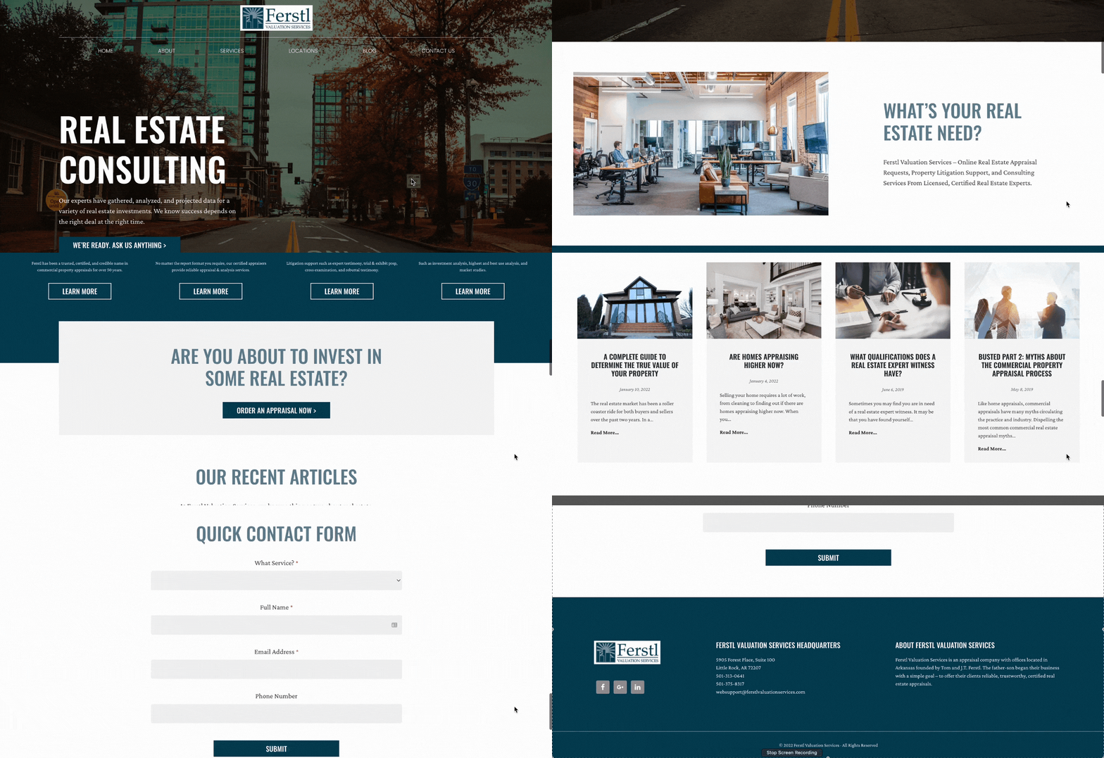
Anyone involved in real estate will confirm that, “the first bite is with the eye.” Ferstl Valuation Services work on the same premise in their freshly designed website.
The business focuses on real estate appraisal and associated services, and this is clear from the moment you land on their page. Their hero image alludes to a commercial real estate bias which is quickly confirmed by delicate icons and office-related shots a little further down the page. All page elements are wrapped in tones of grey and a soft blue denoting quiet, understated professionalism.

Clear Messaging
Arkansas Association of Area Agencies on Aging is an excellent example of a design that considers its target audience. The opening image and clear copy tell you exactly who they are and what they do. (A refreshing approach in today’s verbose online space!)
Did you notice the size and choice of typeface? Yes, a sans serif font in bold colors against a contrasting background; white on dark blue followed by dark blue and grey on white.
With cleverly spaced text and helpful imagery, this website appeals to the demographic it targets. It’s easy to read and simple to navigate.

Create a Roadmap
Pictures grab a reader’s attention and provide a clear structure for easy navigation. Cleverly designed images will tell your audience what do to next and why, without a word.
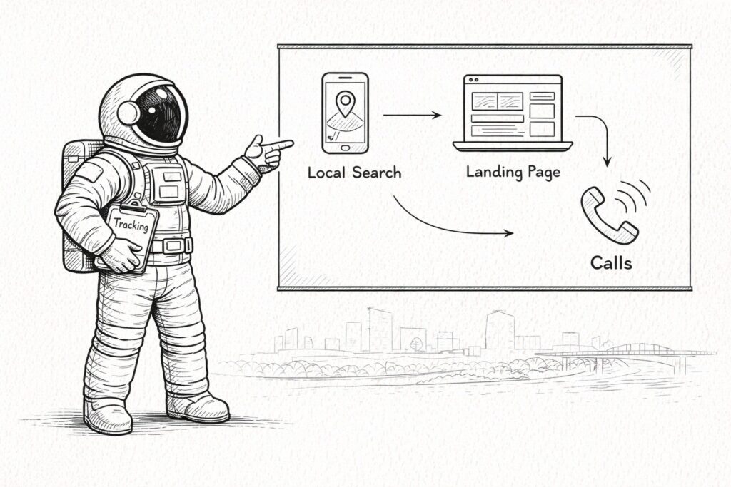
We’ve harnessed these foundational design tenets in our own website to communicate a vision to our customers. The opening image is simple: we will take you from here to there. Further down the home page, you’ll notice another diagram that walks you through our processes and further confirms what you should do next.

These examples, proudly produced by our dedicated Arkansas website designers, showcase the power of professional site design services. Piecing together the various elements for a cohesive, functional, and captivating website is certainly an art.
Get SEO Marketing in Little Rock
Having a beautiful, well-designed website that serves as a brand ambassador and a killer salesperson that will tip the digital scales in your favor.
Where do you start?
A comprehensive web assessment will clarify the best way forward for your growing business. Let us uncover hidden tripwires and dated components, and work alongside you to craft something eye-catching that works for both your customers and the search engines.
Please feel free to get in touch with us to chat about where you are now, and where you want to be. Let’s get your website working for your business.


